CASE STUDY: THE NEVERLANDS
Immersive Experiences at The Edison & Clifton's
UX/UI Strategy Frontend Backend Web Development

UX/UI Strategy Frontend Backend Web Development
The Neverlands is a home to two of Los Angeles’ most stunning nightlife venues: The Edison and Clifton’s Republic. The client wanted a website that speaks “extraordinary” through a world of fantasy, and promotes the venues, events, and products.
Indigo Design Awards
“Gold in Website Design 2020”
Indigo Design Awards
“Gold in Animation & Illustration for Websites 2020”
Awwwards
“Honorable Mention 2020”
featured in “CommArts.com”
<
UX Strategy
Information Architecture
UX/UI Design
Art Direction
Website Design
Custom WordPress
Custom Website Development
The Neverlands website is anything but ordinary and conventional. As a self-proclaimed “purveyor of the world’s most extraordinary and innovative hospitality experiences,” the website is home to some of Los Angeles’s most stunning nightlife venues: The Edison, named among top bars in the world; and Clifton’s, a historic Los Angeles cafeteria turned nightlife venue. The site is visited by Los Angeles patrons as well as people worldwide seeking to explore the city’s nightlife. While there is a variety of people coming to Clifton’s and Edison in person and online, they are all seeking the extraordinary—and expect nothing less. The website needed to reflect this level of curiousity, adventure, and imagination.
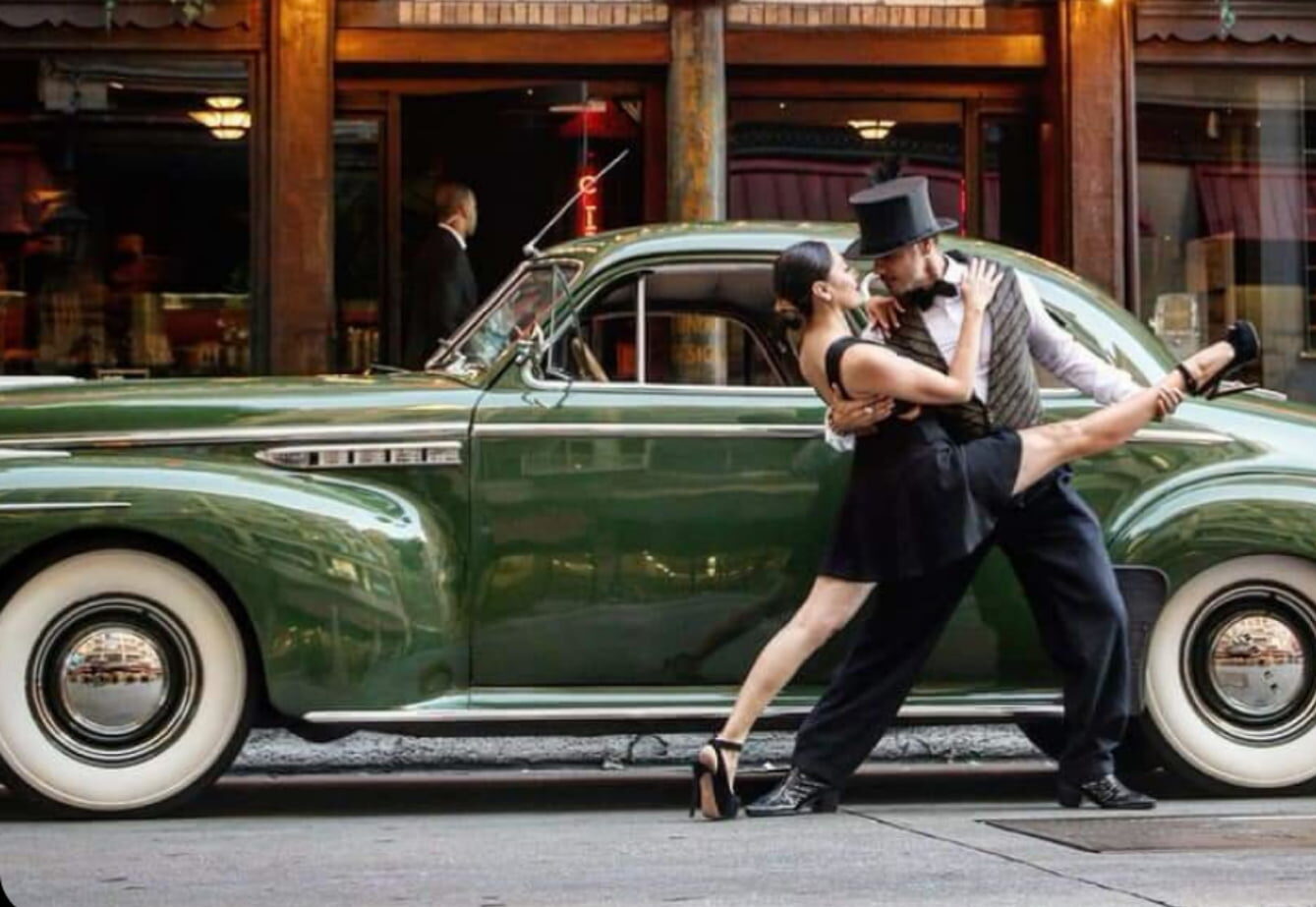
An incredible amount of time was invested in the storytelling behind the illustrated screens and how users would travel through each of the main venue pages. The correct balance of elements on screen and how the elements behave on-scroll was one of the two greatest challenges we faced.
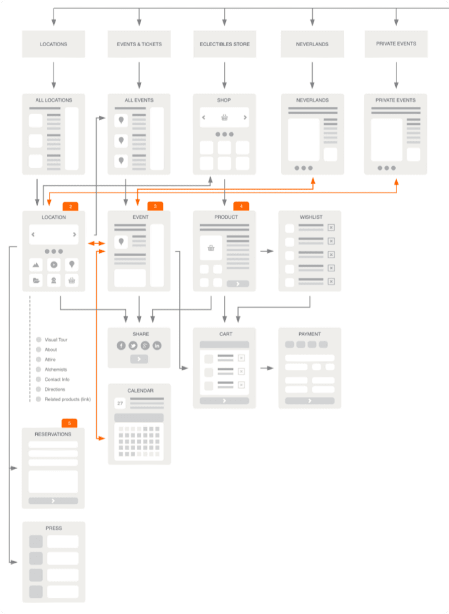
The second challenge, and perhaps an even greater one, was how to give users a good, clear navigation experience on a website where the client wanted to prioritize imagination and inspiration above all. The style of the site mimics the feelings and experiences users have when visiting the physical spaces, but online, we have to give them a way to quickly get to the information. We wanted to simplify the site structure as much as possible, with the site being so graphically intense and visually nonconventional. Our main site nav uses the idea of a navigation chart and is represented by a dangling star as a nav icon. Simple in execution, but again focused on the illustrations. We also added the main navigation to the persistent footer on the site so that there are multiple ways of getting to the relevant content.
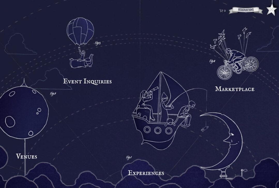
Intended to inspire above all, the site provides a glimpse at the experiences inside The Edison and Clifton’s, their events, and includes the ability for restaurant patrons to purchase tickets and buy a select number of unusual products through the website. We translated the magical and curiosity-driven quality of the physical spaces to the digital experience through the use of custom hand-painted illustrations by Shannon Stamey that we helped art direct—especially keeping in mind how they would be used on screen with parallax effects and mouse-movement. The art of the illustrations uniquely defines the website style; we built upon this idea throughout the site through manipulation of other artworks and assets, in addition to programming a lot of custom animations and interactions. We are very happy how this whole imaginary world evolved and that we were able to build it into a functional, cross-platform experience.
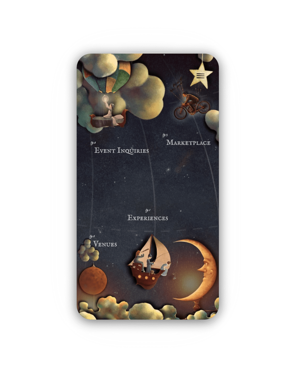
We used a custom WordPress installation to power the back end. The website is completely custom coded on the front end with lots of custom JavaScript and CSS. We modified the terrific open-source parallax script by Matthew Wagerfield as the main engine behind the landing page movement. We also built a lot of other custom features that happen on venue pages such as The Edison, Clifton’s Republic and Pacific Seas as users scroll, making it feel as if you descend into the city, down the tree canopy or into the ocean. We are very happy with how all that turned out!
Fans of both The Edison and Clifton’s Republic spaces are thrilled by a digital presence that matches the eccentric nature of these iconic LA venues. The positive feedback from fans has been inspiring and the site has already achieved recognition in the design community – an honorable mention on awwwards.com as well as a Gold Medal for Website Design on Indigo Design Awards!
PROJECT URL
www.theneverlands.com
FOLLOW
Partner with ActiveColor to build your next-level digital health product.