CASE STUDY: THE PEARLMAN COLLECTION
Showcasing Van Gogh & Cézanne
UX STRATEGY UI DESIGN WEB DEVELOPMENT

UX STRATEGY UI DESIGN WEB DEVELOPMENT
MISSION
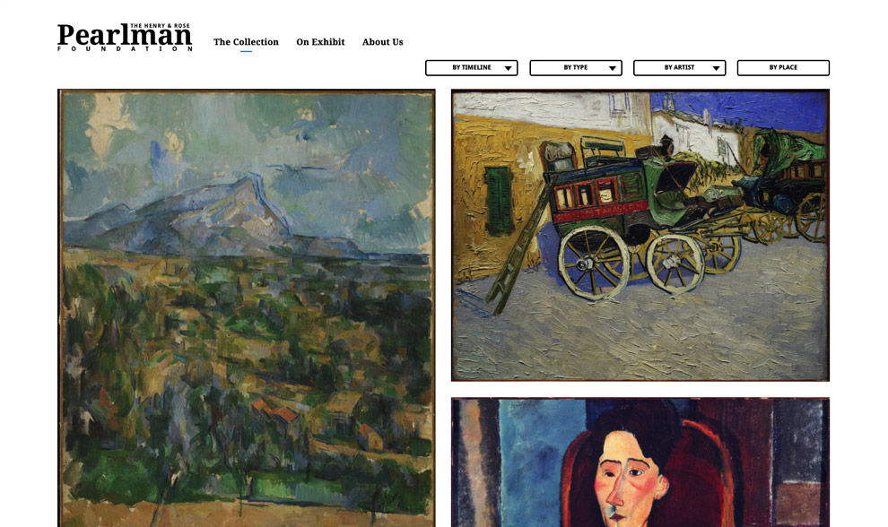
The Pearlman Collection is a collection of Impressionist and Post-impressionist art in a family foundation primarily housed at the Princeton University Art Museum, with individual artwork regularly loaned out for display in galleries and museums around the world. Together with Four Faces, our partners and lead of the project, we sought to design an online gallery including masterpieces by Van Gogh and Cezanne that showcases the art, encourages deeper exploration, and represents the aesthetic of the Pearlman Collection to a global audience.
OUTCOME
A custom mobile responsive website and online gallery with an engaging and interactive modern design where the beauty and details of the art are the center of attention. The interaction with the art – filtering of the collection, audio commentary, and ability to view the back of the paintings, make this online collection stand apart.
IMPACT
Increased accessibility and awareness of the art and the artists in the collection that cannot always be on public exhibit in a museum through visual and audio representations.
PARTNERS
Four Faces
Brand Strategy
Visual Identity Design
UX Strategy
Information Architecture
UX/UI Design
Website Design
Custom WordPress
Custom Website Development
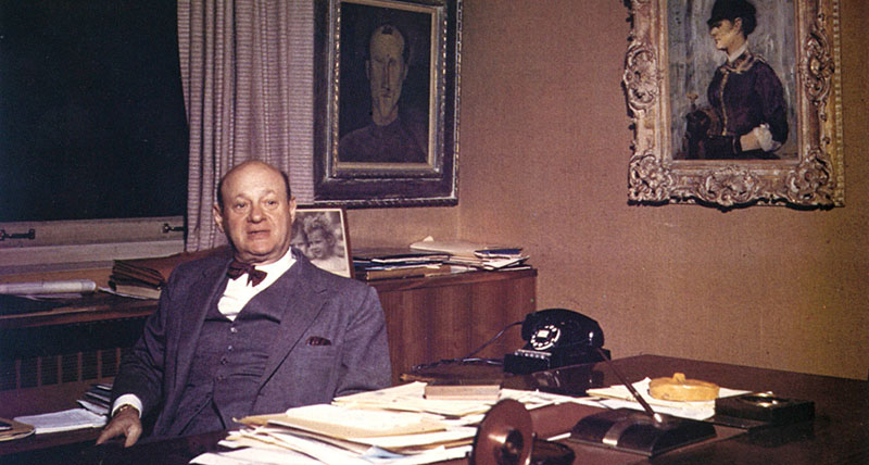
Henry Pearlman (1895-1974), was a lifelong resident of New York City and primary collector of post-impressionist artwork. In 1919 he founded his own company, Eastern Cold Storage, and, in 1925, he married Rose Fried. He began purchasing avant-garde art in 1945 with a Chaim Soutine landscape, triggering a passion for collecting that endured for the rest of his life. Over three decades, Pearlman acquired works by Soutine, Modigliani, Cézanne, Van Gogh, Renoir, Manet, Matisse, and Toulouse-Lautrec, as well as lesser-known artists with modernist visions. From the mid-1970s, the Pearlman Collection has been on loan to the Princeton University Art Museum, where it is seen and studied by visitors, scholars and students.
With this website, the directors of the Henry and Rose Pearlman Foundation hope to provide an engaging self-guided exploration of the collection. Exposing works of art to those who cannot view them in person, the site also attempts ways of organizing and viewing art that would be challenging, or impossible, even with such a visit.
Our project partners Four Faces had a clear vision for the Pearlman Foundation, based in featuring authenticity and putting the artwork front and center. Together we guided the client through a discovery and strategy process to identify key goals and priorities. We identified the user personas that we are targetting and mapped out the user experience.
We started the project off by giving the client a refreshed visual identity system and a new logo. The new brand is elegant and timeless and guided the rest of our design choices and UI.
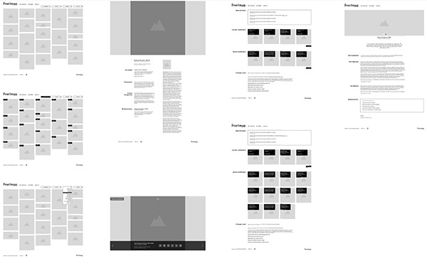
We followed up the process by creating wireframes and quickly moving to full, high def designs for both desktop and mobile. With approved design in hand, our development teams embarked on a series of development sprints, simultaneously working on front end and back end in regular communication with the client. We paid additional attention to making the content management backend streamlined and easy to update, with regular testing by our team to ensure ease of use.
The resulting website offers visitors an engaging, interactive experience that gives the users an extra piece of interaction with the art itself that is not possible in the museum setting.
The site really stands out thanks to two of the features we implemented:
1. Advanced sorting and filtering of the artwork in the collection, and
2. The ability for the viewers to “flip the paintings” and see the incredible historical details that are present on the back of each painting, giving users a true glimpse into the history, creation of the work, as well as an increased realism to experience these paintings as three dimensional objects rather than as simply digital reproductions. We let the art speak for itself – front and back!
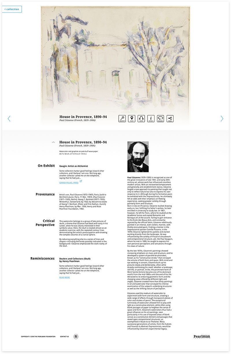
After final feedback and input from the client on designs, we developed an elegant and responsive front-end with an easy to manage client management system.
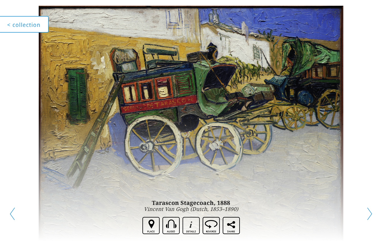
A custom mobile responsive website and online gallery with an engaging and interactive modern design where the beauty and details of the art are the center of attention. The interaction with the art – filtering of the collection, audio commentary, and ability to view the back of the paintings, make this online collection stand apart.
PROJECT URL
www.pearlmancollection.org

FOLLOW
Partner with ActiveColor to build your next-level digital health product.