CASE STUDY: LAWRY’S RESTAURANTS
Lawry’s as an Elevated Digital Experience
UX STRATEGY UI DESIGN WEB DEVELOPMENT

UX STRATEGY UI DESIGN WEB DEVELOPMENT
MISSION
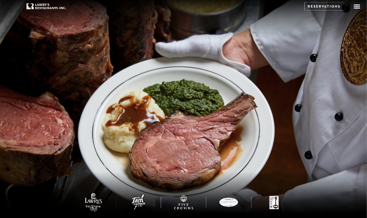
The moment you arrive, you’ll know Lawry’s is an extraordinary brand – a place of grand style, classic elegance, and luxurious comfort. A piece of the history of Los Angeles. Lawry’s website needed to reflect the luxury of the brand on all devices, while creating a cohesive experience and that prioritizes their online conversions.
OUTCOME
A website designed with an understated sophistication and a uniquely and subtly innovative experience, showcasing each brand and location while maintaining a consistent user flow. Business needs such as reservations, gift cards, private events, loyalty programs, and shop are prioritized and prominently featured, and the steps to conversion are optimized.
IMPACT
User flow throughout the website – from desktop or mobile devices – is more easily navigable. Bounce rate has been reduced by nearly 25% and pageviews have increased 129%. Site engagement has also increased by about 50%, with more people visiting the site for longer sessions. Furthermore, the site is consolidated and therefore easier to maintain and manage. The website distinguishes Lawry’s even further from their competition, elevating their digital presence as a fine dining institution and reflecting their new renovations and branding.
UX Strategy
Information Architecture
UX/UI Design
Web Design
Custom WordPress
Custom Website Development
A GREAT LEGACY
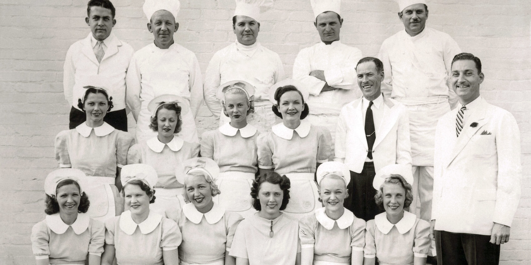
Lawry’s Restaurants is a fine dining company with five distinct restaurant brands in ten US and seven international locations. Lawry’s main brand, Lawry’s The Prime Rib, has a storied legacy as a Los Angeles-born institution with Beverly Hills glitz and Hollywood glamour, serving expertly cut prime rib from a gleaming silver cart. However, Lawry’s Restaurants’ website and mobile presence began to feel dated. Desktop and mobile were maintained in different places as separate sites, and two locations had their own websites, which complicated content management and analytics tracking. Lawry’s Marketing Department, seizing the opportunity given by the refresh and renovation of their flagship Beverly Hills location, sought to bring a new design, better usability, and consolidated services to their web identity.
Lawry’s wanted to create a unique and intuitive experience for their patrons, but also highlight and prioritize their revenue generating pages. Balancing between legacy and modern, user needs and business needs – for five different brands in multiple locations while making the entire experience seem connected and seamless was the great challenge.
Beginning with in-person meetings, our team guided Lawry’s through a discovery and strategy process to identify key goals and priorities. We then identified and fleshed out three distinct user personas and two related subcategories for Lawry’s target audience. We further explored real user behaviour and analytics from their existing site, combining with their market research, in order to map out user experience flows for each persona. We found that key data about their mobile audience were missing and that certain pages with high business value were not experiencing the desired amount of traffic. We also engaged in deeper research, including a competitor analysis and ADA compliance briefing. This step generated both expected and unexpected insights, which were invaluable to design and development.
Working with a style guide for the renovation of Lawry’s The Prime Rib’s Beverly Hills location, we worked with Lawry’s to adapt a digital style direction that would work for both the general and brand specific pages. This direction, along with the user personas and identified business goals, guided our initial designs. Our main challenge was to design for a planned aesthetic absent finished photography due to the ongoing renovations. We regularly engaged with Lawry’s management and Marketing department in order to ensure accurate representation of brand and content, while keeping the end-users and business goals in mind. We opted for an adaptive and minimally elegant design that left room for the photography to set the tone, but that would also make it easy for the users to navigate and reach high value business pages.
With approved design in hand, our development teams embarked on a series of development sprints, simultaneously working on front end and back end in regular communication with the project manager and creative director. We paid additional attention to making the content management backend streamlined and easy to update, with regular testing by our team to ensure ease of use.
We were in regular communication with Lawry’s and their various stakeholders throughout. We coordinated with their IT team to coordinate timelines, access to key platforms, and procurement of necessary licenses. We communicated with their finance team to understand the business flow of their shop, gift cards, and loyalty programs. We also held calls with their external marketing team to ensure their concerns regarding ongoing digital advertising were addressed. Along the way, we held key milestone demonstrations with Lawry’s to update on progress towards the target timeline.
The resulting website offered patrons a delightful and memorable experience, the restaurant administration a much more maintainable web presence, and the restaurant franchises a more streamlined marketing channel.
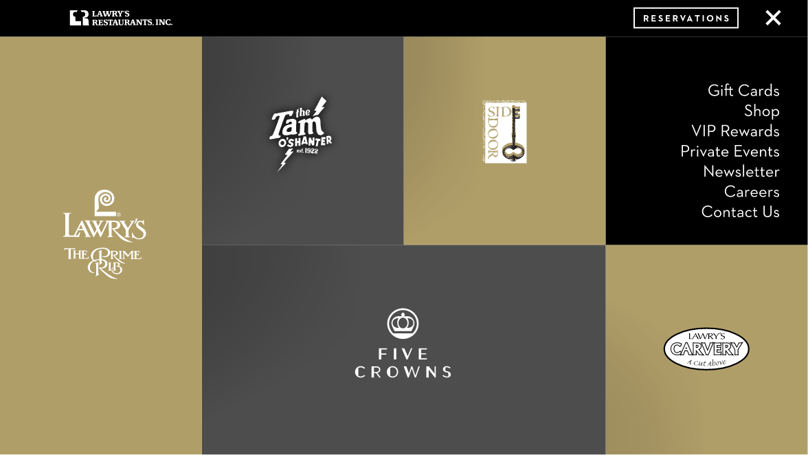
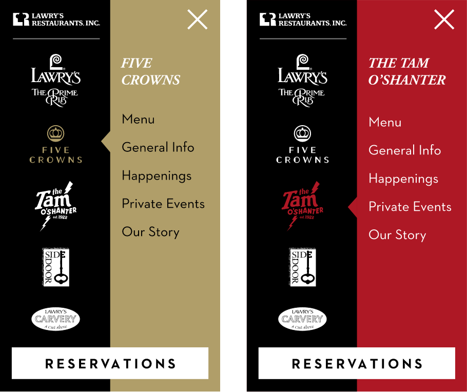
We were able to include unique features into the site to enhance the experience and improve usability and retention.
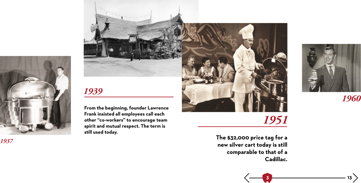
We introduced Our Story, an interactive timeline showcasing the storied history of Lawry’s Restaurants, giving the user a real sense of authenticity and tradition in an innovative way. The site launched with the global Our Story of Lawry’s Restaurants, but the design also allows for individual brand stories to be added in the future.
We also implemented geolocation for four of the brands, so that users are automatically directed to the nearest restaurant location page, reducing the number of clicks users have to make to get to where they want to go. Individual location pages are experiencing higher traffic, with geolocation providing a more relevant experience.
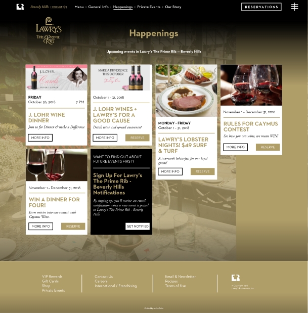
We integrated restaurant events from the Lawry’s A La Carte newsletter automatically in a new Happenings section, so that users would not need to redirect away from the site to see what was happening at their favorite location.
We integrated restaurant events from the Lawry’s A La Carte newsletter website to automatically in a new Happenings section, so that users would not need to redirect away from the site to see what was happening at their favorite location.
With this programmatic feature, it is much easier for the admins to maintain events across two separate platforms, and the user experience on each of the website is consistent and predictable.
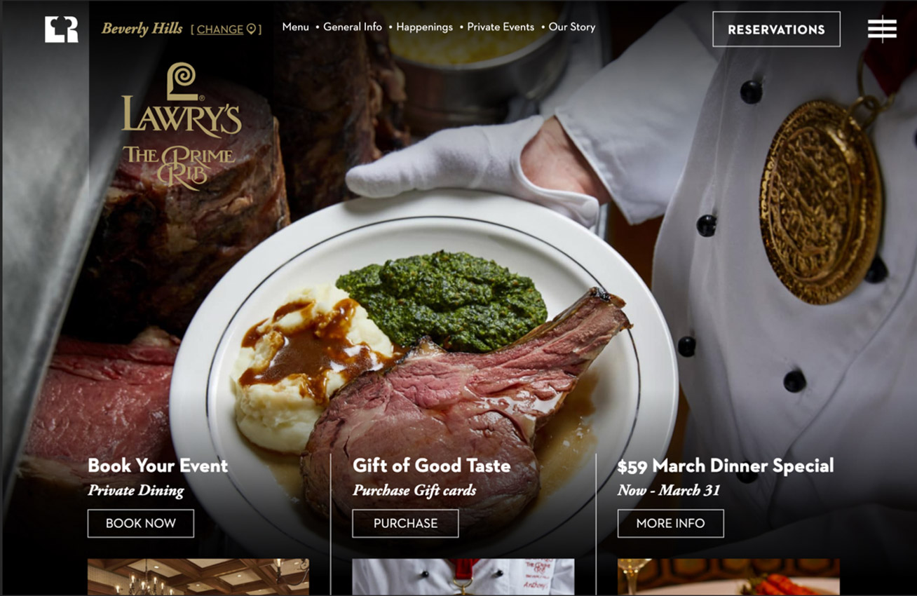
The new website offers patrons a delightful and memorable experience, the restaurant administration a much more maintainable web presence, and the restaurant franchises a streamlined marketing channel.
PROJECT URL
www.lawrysonline.com

FOLLOW
Partner with ActiveColor to build your next-level digital health product.